Design System
Building scalable design systems with reusable components, typography, and guidelines to ensure consistency and faster product development.
Category
-
Client
-

Background
Context
Building a design system for the way I work.
I created my personal design system to bring consistency, speed, and structure to the products and interfaces I design.
Instead of rebuilding common UI elements for every project, I wanted a flexible collection of reusable foundations and components that I could continuously improve and adapt across different products.
The system acts as my personal source of truth — from colors and typography to components, states, and interaction patterns.
The problem
Starting from scratch every time doesn't make sense.
Across different projects, I found myself repeatedly creating the same UI patterns — buttons, inputs, cards, navigation, tables, alerts, and other components.
While this works for individual screens, it makes it harder to maintain consistency and slows down the design process as projects become larger.
I wanted a system that would help me:
Design common interfaces faster.
Keep visual styles consistent across projects.
Reuse components instead of recreating them.
Maintain predictable interaction patterns.
Experiment without breaking the overall system.
Create a foundation that can grow with my skills and projects.
My role
Designed, structured, and maintained entirely by me.
This is my personal design system, so I handled the complete process — from defining the foundations to designing components and documenting their usage.
My work included:
Design system architecture
Color and semantic color tokens
Typography system
Spacing and sizing
Grid and layout rules
Border radius and elevation
Iconography
Buttons and controls
Form components
Cards and content components
Navigation patterns
Tables and data components
Feedback components
Component states and variants
Responsive patterns
Component documentation
Continuous refinement
Tools: Figma · Storybook


Result
What I built
From basic foundations to reusable UI components.
I started with the visual foundations and gradually built them into reusable components that can be used across different interfaces.
The system is designed to be flexible rather than rigid, allowing me to adapt components to different product requirements while maintaining a consistent visual language.
Key deliverables:
✓ Color system and design tokens
✓ Typography scale
✓ Spacing and sizing system
✓ Grid and layout foundations
✓ Border radius and elevation
✓ Icon system
✓ Button components
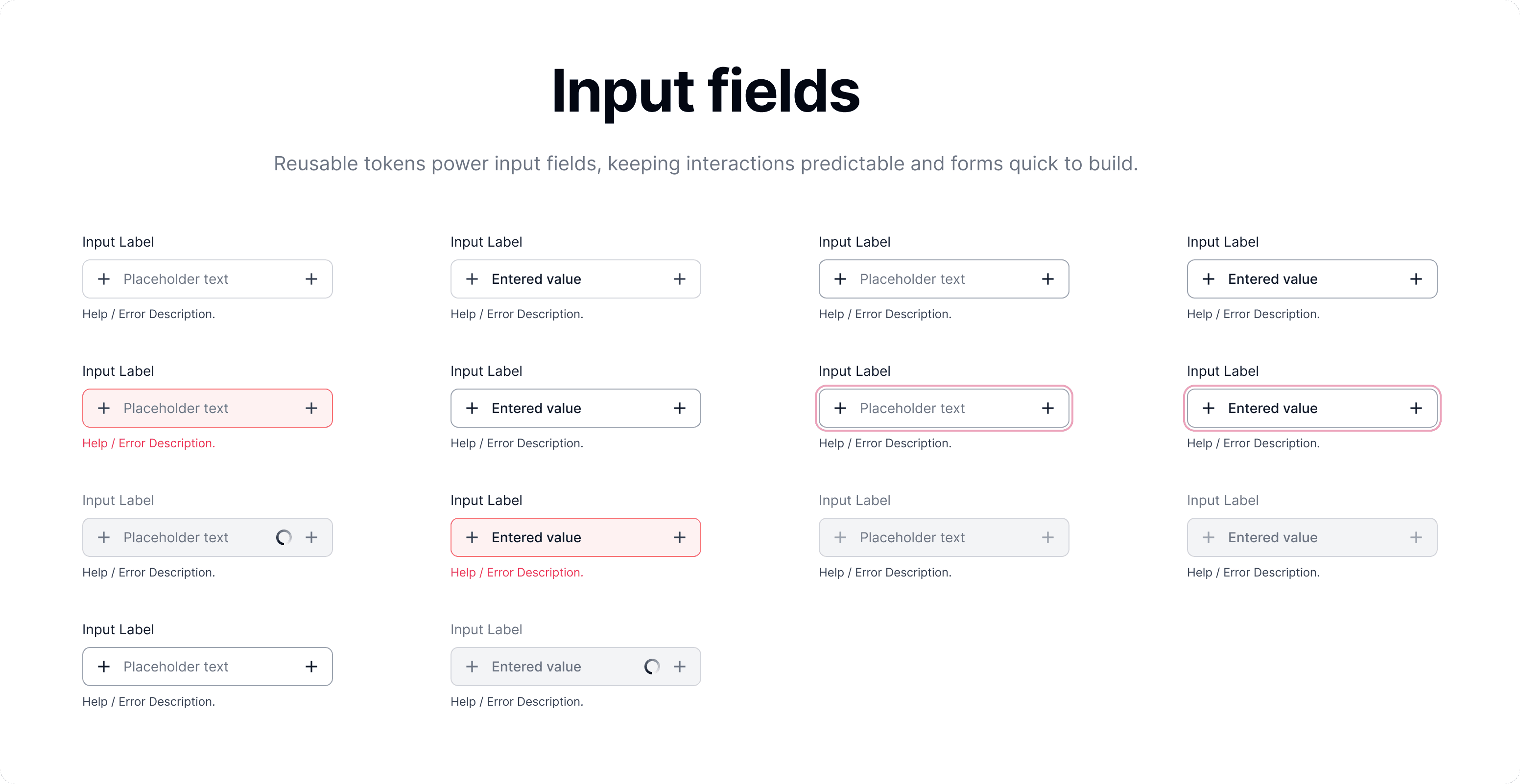
✓ Input and form components
✓ Dropdowns and menus
✓ Cards and content components
✓ Tags and badges
✓ Alerts and feedback components
✓ Tables and data components
✓ Navigation components
✓ Pagination and breadcrumbs
✓ Component states and variants
✓ Responsive patterns
✓ Developer-ready component specifications
Key design decisions
01 — Start with a strong foundation.
Before creating complex components, I defined the basic rules for color, typography, spacing, sizing, radius, and other visual properties.
This gives every component a shared foundation and keeps the overall system consistent.
02 — Components should be reusable, not repetitive.
I designed components with variants and properties instead of creating separate components for every small use case.
This allows the same component to adapt to different situations while keeping its core structure consistent.
03 — Design every important state.
A component isn't finished when its default state looks good.
I consider states such as hover, active, focus, disabled, selected, loading, error, and success wherever they are relevant.
This makes the components more realistic and ready for actual product use.
04 — Keep the system flexible.
My goal wasn't to create rules that restrict creativity.
The system provides a consistent foundation while leaving enough flexibility to adapt components to different products, layouts, and requirements.
05 — Design with development in mind.
I structure components and specifications so they can be understood beyond the Figma file.
Where applicable, I also use Storybook to represent reusable UI components and create a closer connection between the design system and implementation.
06 — Continuously evolve the system.
A personal design system is never really finished.
Whenever I encounter a new pattern or solve a recurring UI problem, I evaluate whether it should become part of the system.
This keeps the library useful as my design approach and projects evolve.
Outcome
A system that makes my design process faster and more consistent.
My personal design system gives me a reusable foundation for starting new projects instead of rebuilding common UI patterns from scratch.
It helps me move faster from ideas to polished interfaces while maintaining consistency across different screens and products.
More importantly, it has become a place where I continuously refine how I approach UI design.
The impact:
Reusable foundation
A consistent starting point for new projects
Faster workflow
Less time spent recreating common UI
Consistent interfaces
Shared visual and interaction patterns
Scalable components
Flexible components built for different use cases